

How to use New York through the years
A short guide to the dashboard: how to find a series, read it, cut it your own way, change the view, set two side by side and take the numbers away.
1 Find a series
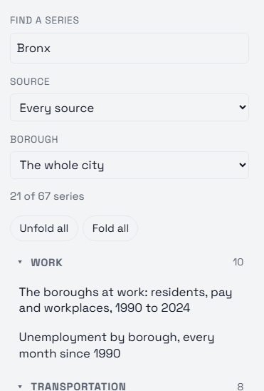
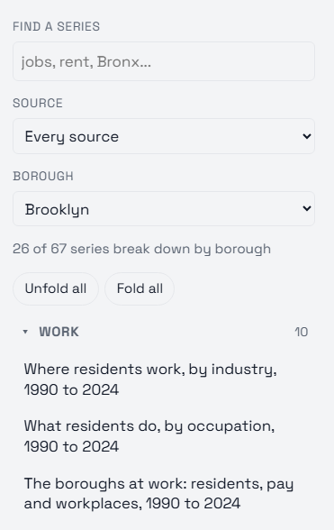
Every series is listed on the left, grouped by topic: work, transportation, housing, families, migration, public safety, prices, population, homelessness, weather, fires and flooding, and New Jersey across the Hudson. Click a topic to fold or unfold it, or use "Fold all" to scan the topics alone; click a name to open it. Rest the pointer on a name, or on any menu, button or tile of the dashboard, and a small note says what it is or what it does.
Type in "Find a series" to narrow the list: it matches the names of the series, of their lines (a borough, a sector, a kind of call) and of their sources. "Source" keeps the series from one dataset, the Census Bureau’s surveys or the FDNY’s dispatch file, say.
2 Read the chart
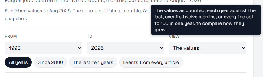
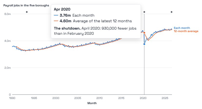
Move the pointer over the chart, or click it and use the left and right arrow keys, and a readout lists every line’s value at that point. Above the chart, a line names the topic and the source; the title and subtitle say what is counted.
Small diamonds along the top mark the moments the article points out; the readout names them. A thin vertical line marks a break, where a survey changed its question or a new estimate series begins: the lines are not joined across it, because the two sides are not measured the same way. Short ticks on a survey’s points are its 90% margins of error.
"Events from every article" marks on any chart the moments all our articles point out, the pandemic’s shutdown or a new law, each with the article it comes from, so a turn in one series can be read against what happened.
3 Cut it your way
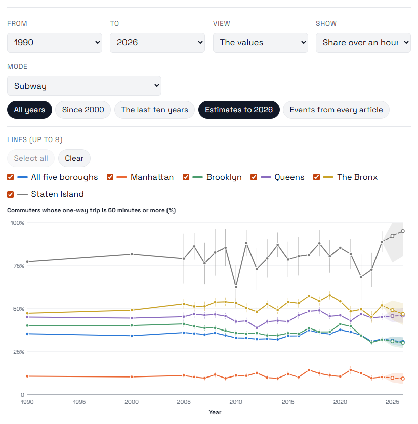
The menus under the title are the article chart’s own: a borough, a way of getting to work, a kind of ambulance call, a crossing into the toll zone. Change one and the chart redraws at once.
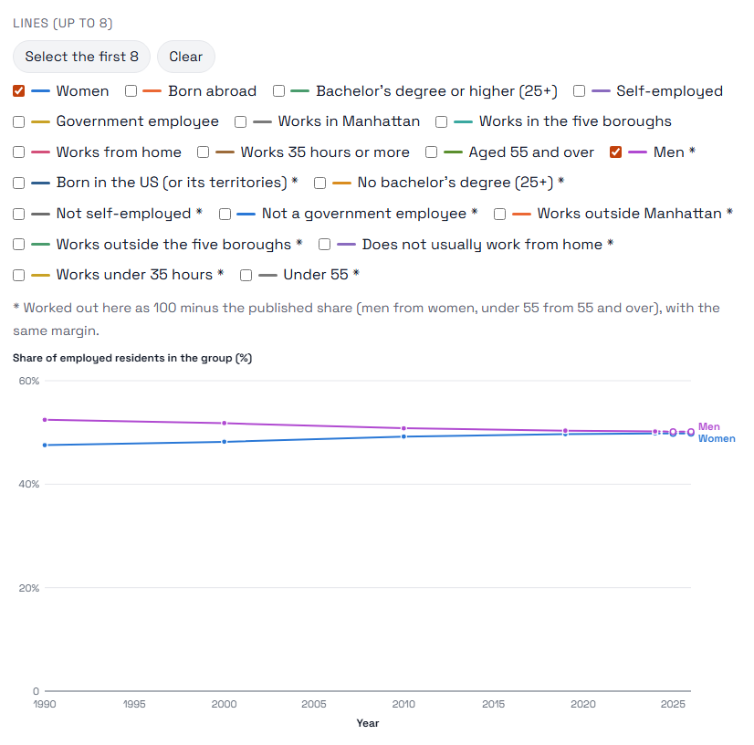
Under "Lines" you choose which lines to draw, up to eight at a time. Each line keeps its colour whatever else you switch on or off.
"Select all" ticks every line (the first eight, when there are more) and "Clear" unticks them, to start from the one or two you want. Where an article charts one side of a share, women or residents aged 55 and over, the other side is there too, men or residents under 55: worked out as 100 minus the published share, with the same margin, and marked with a star.
4 Narrow the years
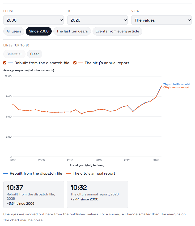
"From" and "To" set the years; "All years", "Since 2000" and "The last ten years" are shortcuts.
The tiles under the chart give each line’s latest value and how far it has moved since the first year shown. They are worked out on the page from the values the article charts. For a survey, a change smaller than the margins on the chart may be noise.
5 Carry it on to 2026
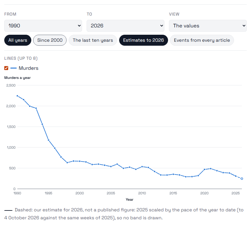
Most sources publish a year or two behind: the census surveys run to 2024, the crime counts to 2025. Where a series stops before 2026, "Estimates to 2026" carries each line on from its latest value at its recent pace, a pace that fades by a fifth each year, so the line levels off rather than running away; a monthly line is the same month a year earlier plus the latest change from a year earlier, which keeps the seasons.
The estimate is drawn dashed, inside a shaded band. Where a line is long enough to test the rule on its own past, the band is how far the rule has missed there, four times in five; most census series have only a few points, years apart, and for them the band is the line’s usual change in a year, widened for each year ahead. The legend says which. Where the year so far has been counted (the police’s weekly crime totals), 2026 is not a trend at all: it is 2025 scaled by the pace of the year to date, with no band.
The readout, the table and the CSV all say which values are estimates, and the tiles never use them. A line that ended earlier stays ended, and a survey redesigned too recently to have a trend (the housing survey’s 2021 and 2023 rounds) is not carried on. Click the button again to see the published values alone.
6 Change the view
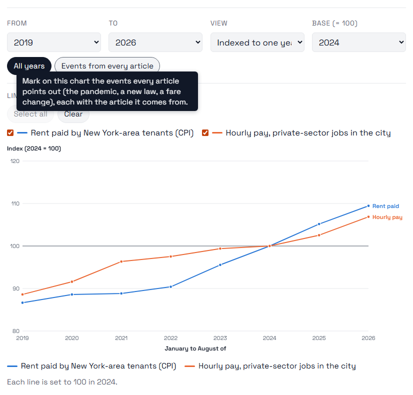
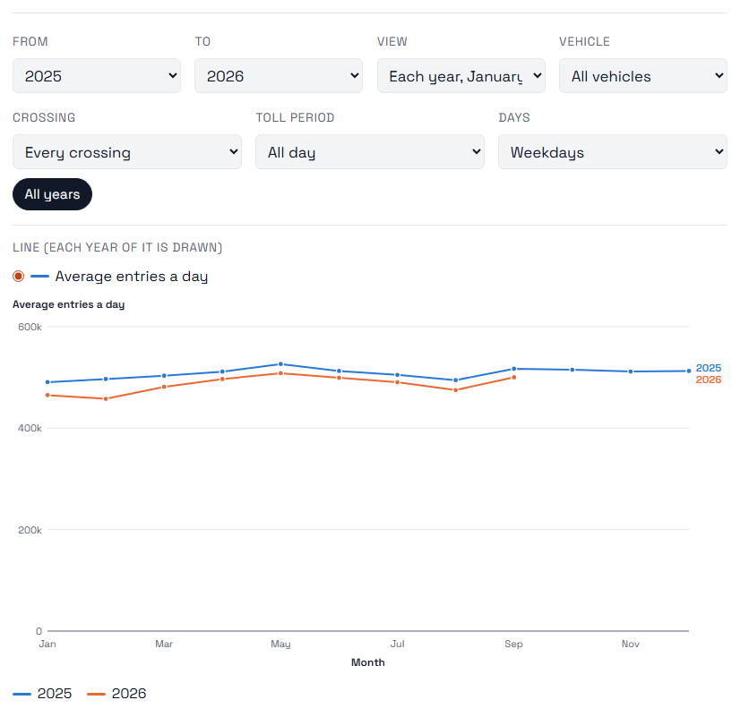
"View" draws the same numbers three ways. "The values" is the series as counted. "Indexed to one year" sets every line to 100 in the year you pick under "Base", so lines of very different size can be compared by how they grew. "Each year, January to December" (for monthly series) draws one line a year over the twelve months, so a season can be set against the one before.
We never put two different units on one axis: when the lines you have chosen count different things, such as a price index and dollars an hour, the chart is drawn indexed and says why.
For a count of the whole city, murders or felony assaults, "Per 100,000 residents" divides each year by the Census Bureau’s estimate of the city’s population that year, so a smaller or larger city does not read as more or less crime. The population estimates start in 2000, and so does the rate.
7 See it on a map
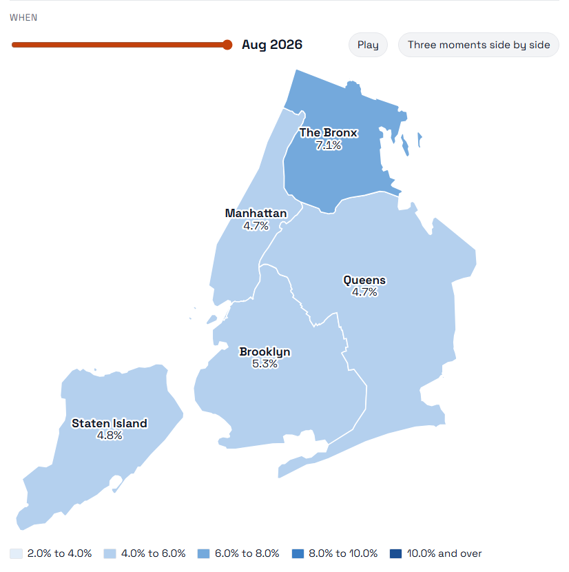
For the series published borough by borough, "View" offers "Map of the boroughs": each borough shaded by its value at one moment, with its value written on it. Drag the slider, or press "Play", to move through time; the colours keep one scale over the whole series, so a change of colour is a change in the numbers, not in the scale.
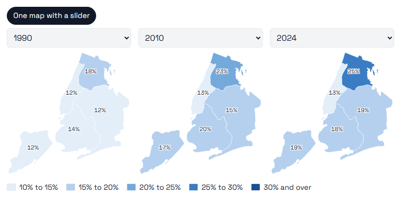
"Three moments side by side" draws up to three points in time next to each other, on the same scale; pick each from its menu. Values marked with a star are estimates. The table under the map lists every borough’s value at every point.
Where a series also covers our neighbours across the Hudson, the population and unemployment, the map takes them in: Hudson, Bergen, Essex and Union counties, with Jersey City, Hoboken and Newark drawn on top of their counties. A county is coloured by its own figure, its cities included.
8 Pick a borough
Under "Borough" in the catalog, pick one of the five: the list keeps the series that are published borough by borough, and each opens at that borough, with the whole city beside it where the source has both. The rest are published for the city only, and say so if you open one.
The boroughs’ own series include their population every year since 2000, from the Census Bureau’s estimates, their unemployment every month since 1990, from the State’s Department of Labor, their median rent every year since 2015, from the census survey, and, month by month, their shootings, evictions, fires, flooding complaints and homeless shelters.
9 Set two series one above the other
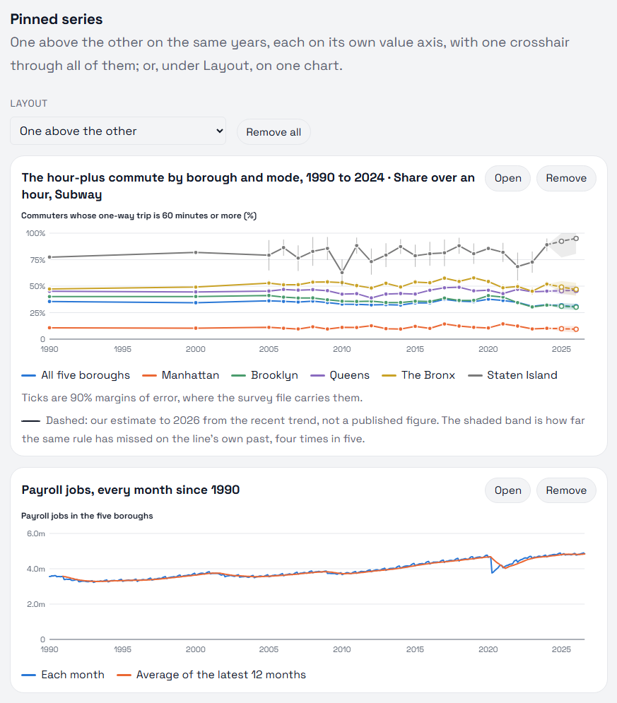
"Pin to compare" keeps the series as you have cut it below the chart. Open another, pin it too, up to six. They sit one above the other on the same span of years, each with its own value axis, and the years line up exactly: move along one and the crosshair moves through all of them, so a turn in one can be read against the others.
"Layout" can put them all on one chart instead: percentages as they are, on one percent axis, and counts or prices each set to 100 at the first point they share, the one fair way to draw things counted in different units together; a mix of the two stays one above the other. "Open" brings a pinned series back into the main chart; "Remove" takes it off.
10 Relate two series
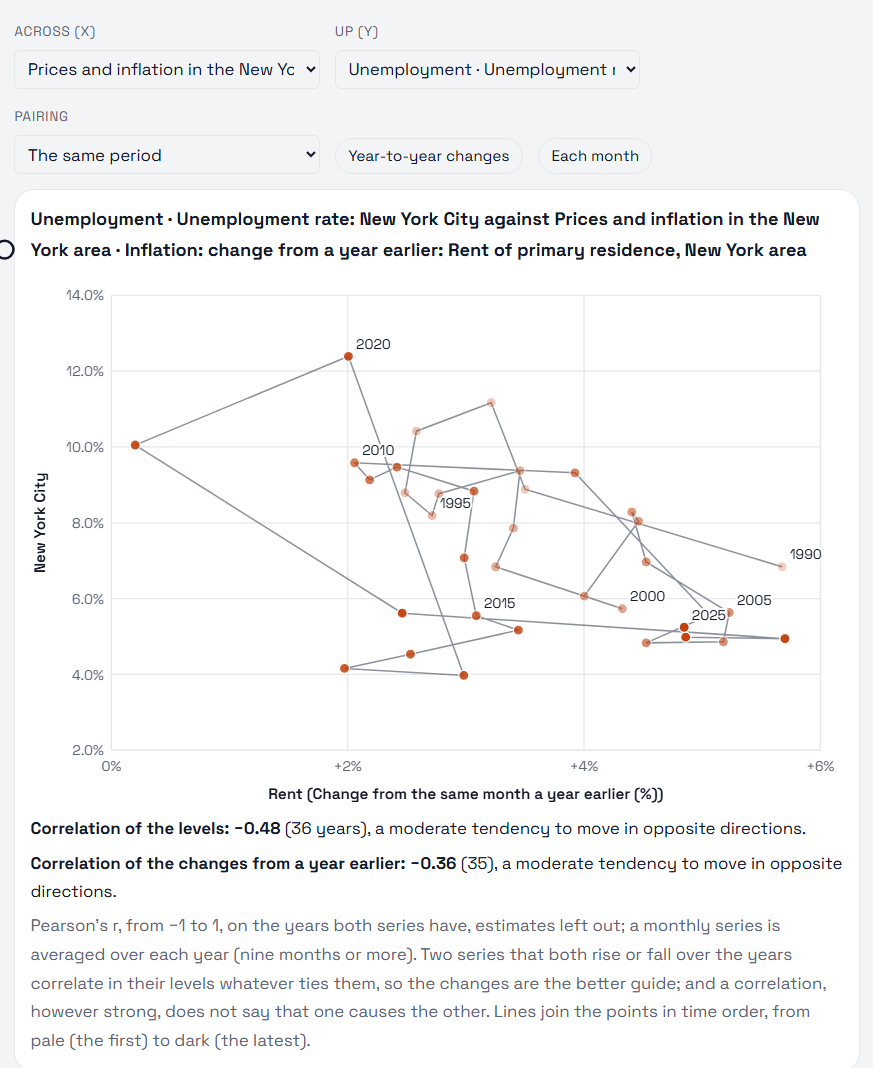
Pin two or more series, then choose under "Layout" how to set them side by side. "Against each other" draws one series across and one up, a point a year (or a month), joined in time order from pale to dark, so you can see whether they rise and fall together. "Pairing" sets the second series a year or more later, to see whether one follows the other, and "Year-to-year changes" draws how much each moved instead of its level.
Under the chart, two correlations: of the levels, and of the changes from a year earlier. Any two series that both grow over the years correlate in their levels, whatever ties them, so the changes are the better guide, and no correlation says that one causes the other. "One divided by the other" draws their ratio, rent per dollar of pay, say. "How they move together" gives every pinned line’s correlation with every other; choose a cell to draw that pair.
11 Take the numbers with you
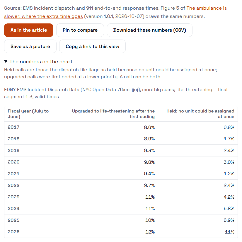
"The numbers on the chart" opens a table of every value drawn, with the article’s note on how they are counted. "Download these numbers (CSV)" saves the same table as a file.
The line above the buttons names the source and links to the figure in the article that draws the same numbers. "As in the article" puts the series back the way the article shows it. Every value on the dashboard is the value the article charts, at its published version, except for a few series no article draws yet, such as prices and unemployment: those are the agency’s published figures, and their source line says so.
"Save as a picture" saves what is drawn, the chart or the maps, as an image with its title and source under it, made in your browser. "Copy a link to this view" copies the address that reopens it exactly as it is.
12 Share what you found
The address in your browser changes as you go: the series, the menus, the lines, the years, the view and anything pinned. Copy it to send someone the exact view you are looking at, or bookmark it to come back to. The dashboard works the same in light and dark: choose under "Colours" at the foot of any page.
On a phone, the catalog folds away behind one button, "Browse the series", so the chart comes first.